The journey of NeoResearch logo
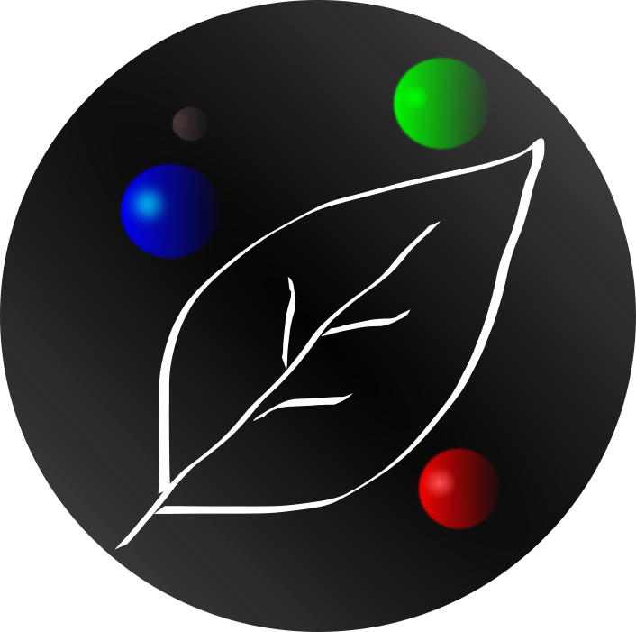
Around February 16th, 2018, NeoResearch member proposed a logo with the following idea:
-
Blue represents the Earth and clean technologies;
-
Red represents Mars and communication protocols for interplanetary distances, embracing Quantum technologies;
-
Green represents Neo and the Smart Economy;
-
The Leaf represents “The Blockchain of Life”, including all life forms;
-
Finally, black represents the struggle to bring enlightenment and vision to adopt these groundbreaking and society changing technologies.

The evolution and contributions
The necessity for improving this logo was clear and soon several members of the NEO community started to suggest different types of ideas on Discord.
A guidelines for logo contributions was opened until we could find the final design.
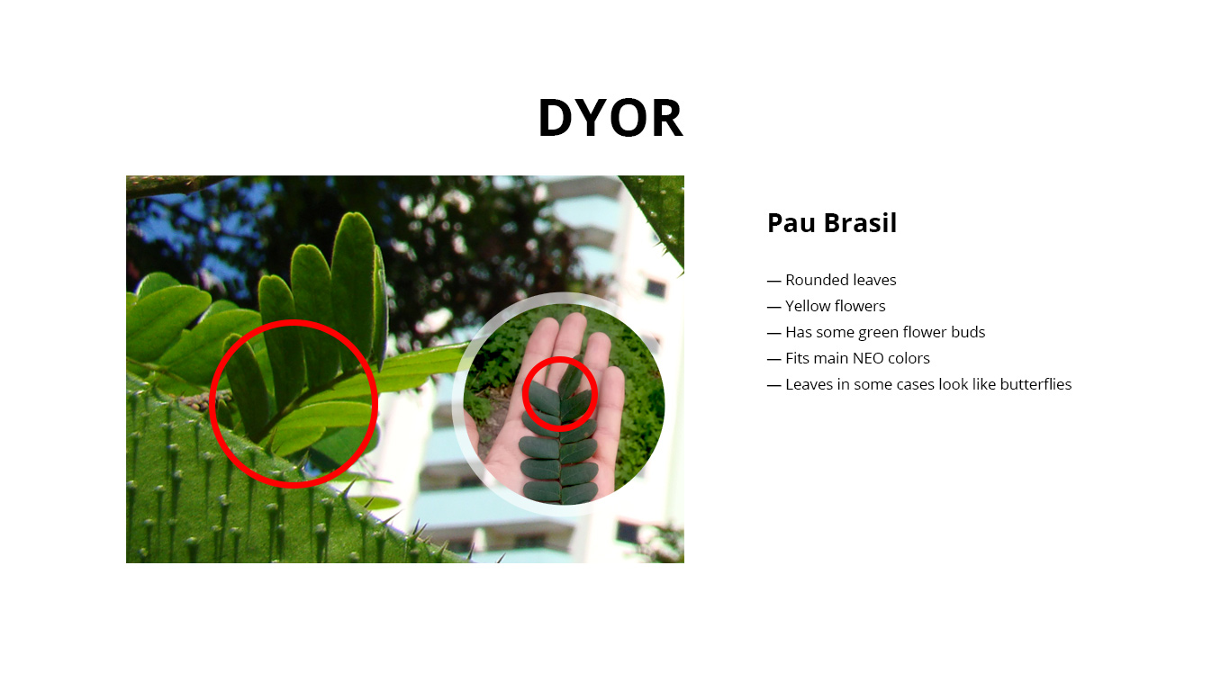
After great insights from @Edge, a logo with Pau Brasil was firstly design.

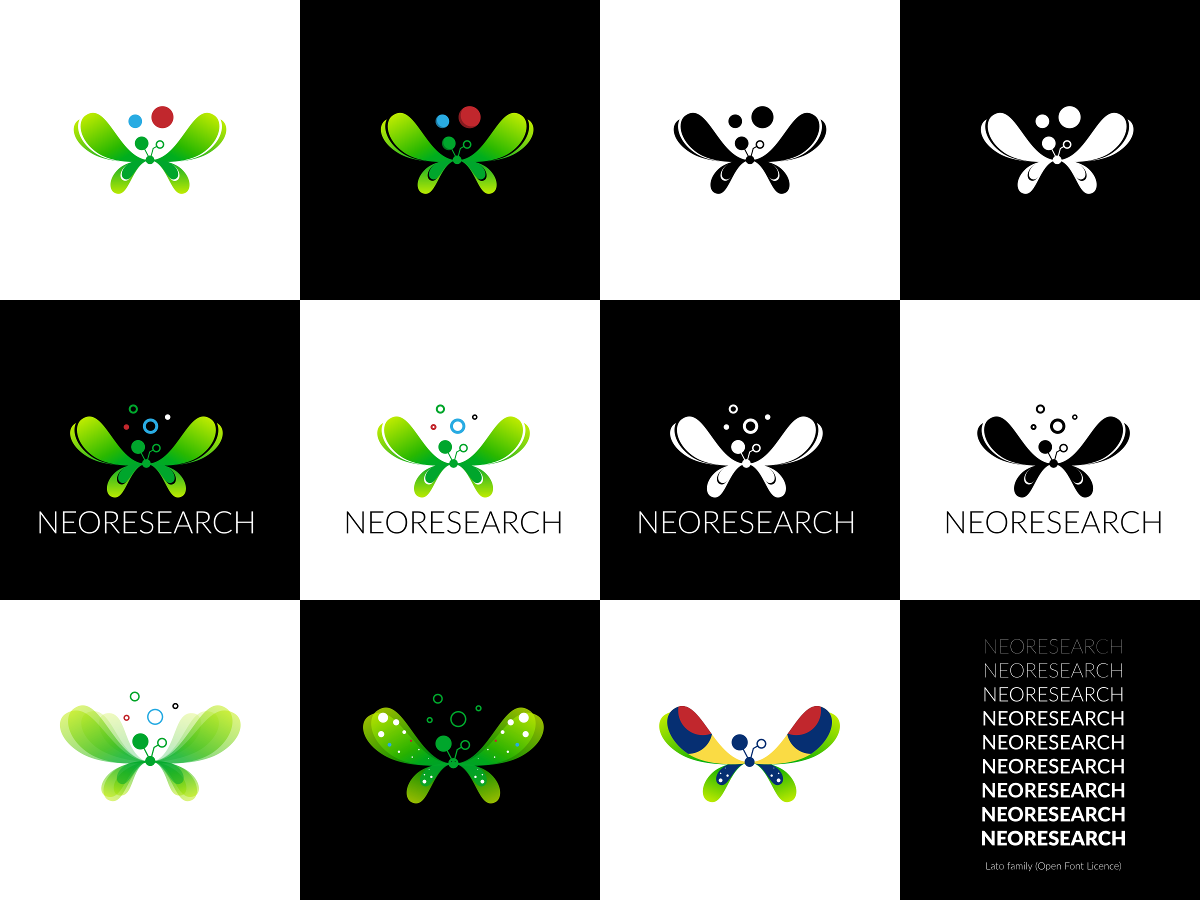
Following this design, http://gemcut.io/ team magnificently created a butterfly with Pau Brasil leaves surround of an art of Golden proportions, guided by the mastermind of @Alex.
All the process of the logo can be found here Gemcut Dyor process.
Around November 29th, 2018, we are able to finally reach the paths for our future logo.

